N_Fiddledog N_Fiddledog:
As to the ice NSIDC is not talking about any current anomaly graph you are likely to see.
There is only scattered data before the satellite era. All he's saying there is if you wanted to you could gather up those bits and make an extrapolation that would agree with the idea this current melt is anomalous.
Yes, the data mostly comes from unreliable sources before satellites, but there are other sources that are taken into account. For example, when a local says the ice used to cover an area all year long, for his lifetime and his grandfather's; but now there is no ice - then it can be as reliable as the old ship captains who recorded extents in the early 1900's.
And the older data agrees with the newer, so it's considered 'good enough'.
N_Fiddledog N_Fiddledog:
The confusion I have over the temp thing is I'm not a math guy, but I always see them arguing over what 30 year trend to use for the anomalies.
Like this -
$1:
3. Choosing an anomaly period.
The choice of the anomaly period is particularly important for reconstructions using CAM, as it will determine the amount of usable records. The anomaly period can also result in odd behavior of anomalies if it is too short, but in general the choice makes little difference to the results. In the figure that follows Mosher shows the difference between picking an anomaly period like CRU does, 1961-1990, and picking an anomaly period that maximizes the number monthly reports in a 30 year period. The period that maximizes the number of monthly reports over a 30 year period turns out to be 1952-1983. 1953-82 (Mosher). No other 30 year period in GHCN has more station reports. This refinement, however, has no appreciable impact.
http://wattsupwiththat.com/2010/07/13/c ... mperature/See, now I am a maths guy, so I see what they are trying every time! 'Picking a period' is just another way to get results you are looking for to fit a certain agenda. In Politics, it's called 'gerrymandering'. In Science, it's 'shilling'.
They use 'noisy' data to try to hide current trends in a statistical model. For example, if a tobacco company didn't want a trend in lung cancer to seem unusual, they'd pick the period 1915 - 1930 for their 'baseline' for comparison. As it happens, after WWI many men took up the smoking habit because cigarettes were included in standard 'care' packages, so all of a sudden the cases of lung cancer skyrocketed after WWI. But compare 1915-1930 to 1970-1985, and the surge of cases in the 70's disappears in the noise. Compare 1970-1985 to 1900-1915, and you'd see the surge.
The same as picking a period for temperatures. 1850 - 1900 is the time when we have the most accurate, and least 'noisy' data because urbanization and industrialization had not yet begun to affect temperatures. The years 1961-1990 would be much 'noisier' than 1850-1900, so any variations will be lost in the statistics. You'd use 1961-1990 to try to hide averages and means in data you don't want to seem as inaccurate, or to show weak trends that you don't want to call attention to.
N_Fiddledog N_Fiddledog:
Specifically when he says this:
$1:
In the figure that follows Mosher shows the difference between picking an anomaly period like CRU does, 1961-1990
A little further on he says:
$1:
This refinement, however, has no appreciable impact.
Which is a bold faced lie!
Another way to 'pick' the data is to have more data points than another. If I flip a coin 50 times, I have 50 data points and can get a rough average for heads v tails. If I flip it a million times, I have more data and I get a more precise and also a different number for heads v tails. Choosing a 30 year period with more readings most certainly affects the outcome!
Other ways to affect statistics and to 'pick' is to compare data that have different levels of error. Yes, I mean satellite vs land based temperature readings, or new vs old ocean surface temp readings. Comparing two sets with different rates of error means that the two results my overlap given the error rate. One set of average heights of third graders may be in metric, with a error rate of +/- 1cm, and another measured in British Imperial with an error rate of 3/8 of an inch. The two may overlap, just from the error rates! Comparing them may be meaningless.
N_Fiddledog N_Fiddledog:
What's he talking about? What is CRU doing? CRU would be the Climatic Research Unit at the University of East Anglia, wouldn't it?
As I say I don't actually understand the totality of how they calculate land surface temps for anomaly graphs I just know I hear them arguing about what 30 year trend to use.
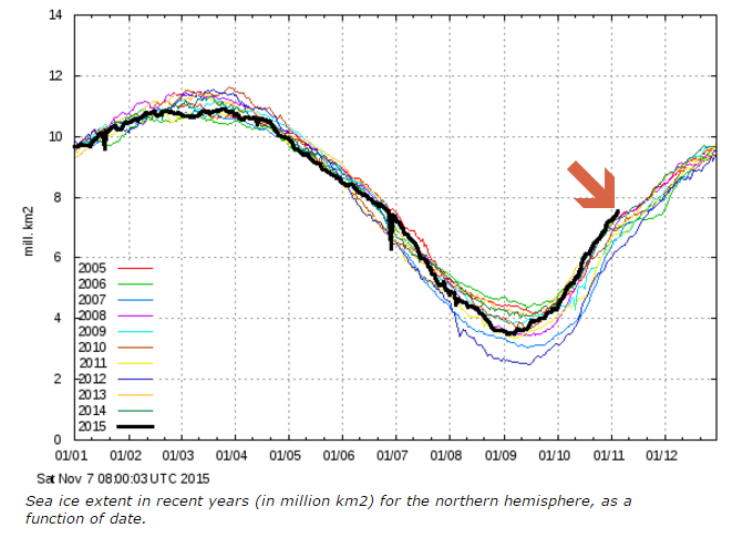
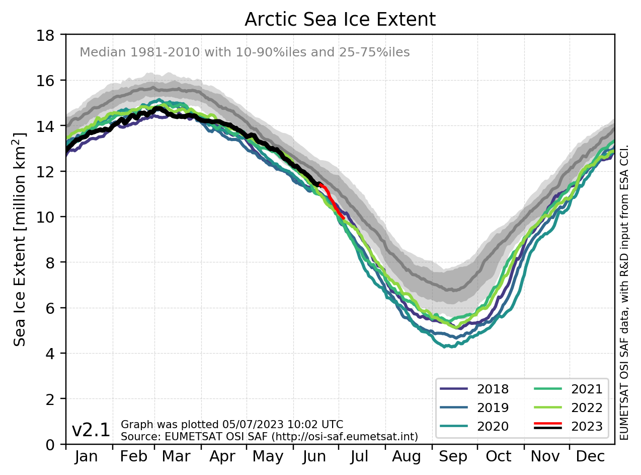
With ice though the graphs you see are using the satellite period of thirty years or so.
I'm not sure what 'CRU' thy are referring to, but you may be right.
I wouldn't pretend to know how they calculate it all as well. I do know the task of getting averages for like data, converting them so the error rates all align and can then be compared in a meaningful way is daunting.
But what I do know is when comparing apples to hen's teeth, someone is shitting on my head and expecting to be thanked for the new hat.
N_Fiddledog N_Fiddledog:
In fact I shouldn't have even allowed myself to be drawn off topic there to talk about land surface temps.
That was dumb of me.
Consider yourself right for now on that if you like.
Scratch those questions above concerning calculating land surface temps.
We're talking about ice for this one.
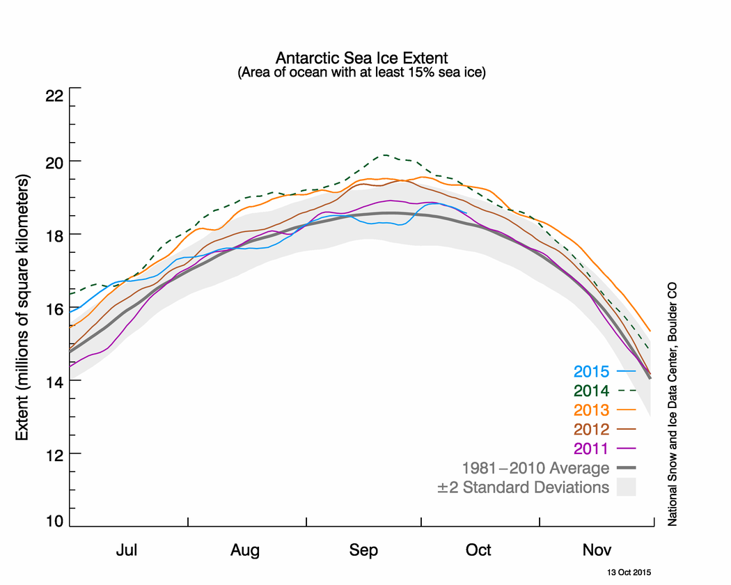
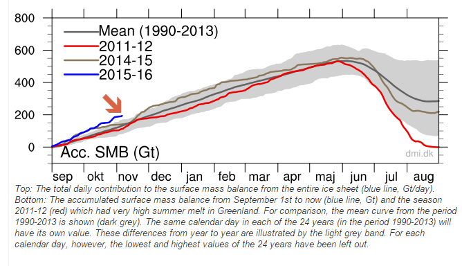
It's fine, because everything I wrote applies to ice as well. The accurate data for ice extents is pretty recent. Comparing them gives a little perspective, but the bigger concern is volume. The data for volume is pretty sparse, until the satellites went up.
The lack of long term (100 year+) data doesn't really give much time for trends to be seen, but it does give us some very worrying short term trends. So what if Antarctic ice extent is increasing, if it's only an inch thick? It's all going to melt next summer anyhow. It's the multi-year ice disappearing, the ice shelves breaking off, and the possibility that the undersea currents that regulate climate that may already be changing that is the worry.


") CKA Moderator
CKA Moderator 


") CKA Moderator
CKA Moderator 
